-
Welcome to the discussion forums. To get posting, register an account.
You are using an out of date browser. It may not display this or other websites correctly.
You should upgrade or use an alternative browser.
You should upgrade or use an alternative browser.
🇬🇧 Celebrity BBUK 2024: Launches 4 March
- Thread starter Brekkie
- Start date
Kingston
Canadian Royalty
If they don’t think a full episode on Saturday would rate I wish they’d at least consider a spin-off. Something with a bit of behind the scenes content and unseen footage. The Saturday blackout (aside from the extended live feed offering) does seem to break up the flow and I do tend to think this would likely pull in more regular viewers than BBLL.
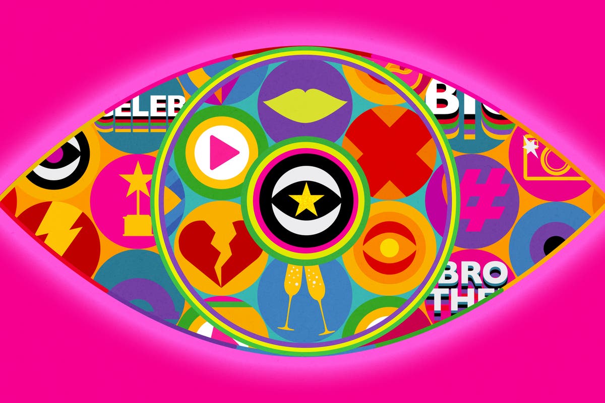
The people on social media complaining that it’s only a 3 week series, and the logo is the same as the main series with a star in the middle, must have no idea how the show started out. I’m looking forward to it being a shorter run with the main series’ graphics.
I think that if you change the graphics every series, it adds to the fatigue. On channel 5 we sometimes got 3 houses, 3 logos and 3 opening titles a year. This trims it down and keeps it feeling fresh when we do get a revamp for the 2024 main series. Plus it makes Big Brother feel like the main event (even if this one is going out on IT 1] and CBB the spin-off.
I think that if you change the graphics every series, it adds to the fatigue. On channel 5 we sometimes got 3 houses, 3 logos and 3 opening titles a year. This trims it down and keeps it feeling fresh when we do get a revamp for the 2024 main series. Plus it makes Big Brother feel like the main event (even if this one is going out on IT 1] and CBB the spin-off.
Kingston
Canadian Royalty
3 week series is fine. The problem I have with that length of a series is that it’s unlikely we’ll see a cast that’s proportional.
I agree about the logo although I will say that they could still use the same format but perhaps change things up a bit more than just slapping a star on it.
It’s unfortunate we have a bunch of holdovers for which the Channel 5 era was BB.The people on social media complaining that it’s only a 3 week series, and the logo is the same as the main series with a star in the middle, must have no idea how the show started out. I’m looking forward to it being a shorter run with the main series’ graphics.
I think that if you change the graphics every series, it adds to the fatigue. On channel 5 we sometimes got 3 houses, 3 logos and 3 opening titles a year. This trims it down and keeps it feeling fresh when we do get a revamp for the 2024 main series. Plus it makes Big Brother feel like the main event (even if this one is going out on IT 1] and CBB the spin-off.
I agree about the logo although I will say that they could still use the same format but perhaps change things up a bit more than just slapping a star on it.
Kingston
Canadian Royalty
?So the theme of the marketing this year is "The Bigger the Celebrity, the Less they Want to be Seen" - basically celebrities hiding from the press/ fans and trying to go unnoticed.
Kingston
Canadian Royalty
This would be a fitting theme considering some of the names being thrown around aren’t even z-listers.Those that didn't want to be seen did the show on when it was on C5.
I’ve seen the casting breakdowns for the adverts and this is the tagline for the ads - I guess it’s the replacement for ‘Big Brother Sees it All’ from last year. But it doesn’t exactly roll off the tongue

Kingston
Canadian Royalty
Another gem. IDK why they had to try and reinvent the wheel with BB20’s tagline considering “BB is always watching” is far more iconic and catchier.I’ve seen the casting breakdowns for the adverts and this is the tagline for the ads - I guess it’s the replacement for ‘Big Brother Sees it All’ from last year. But it doesn’t exactly roll off the tongue
Kingston
Canadian Royalty
matts bb
Always Watching 👀
Kingston
Canadian Royalty
I don’t mind it TBH. I especially love the remix they’re using.Great promo
sav0001
Well-Known Member
February
I think, therefore I am, I think ...
Have any of these been confirmed? And how do we get to watch it here in Aus?
 www.independent.co.uk
All of the rumoured Celebrity Big Brother 2024 housemates
All of the rumoured Celebrity Big Brother 2024 housemates
Including two former ‘X Factor’ judges and one ‘This Morning’ legend
All of the rumoured Celebrity Big Brother 2024 housemates
- Sharon Osbourne. Osbourne pictured in September 2023. ...
- Fern Britton. Britton pictured in 2014. ...
- Jordan North. Jordan North has left his BBC Radio 1 slot. ...
- Chloe Burrows. Former 'Love Island' star Chloe Burrows. ...
- Ekin-Su Cülcüloğlu. Ekin-Su pictured in 2022. ...
- Chloe Brockett.