-
Welcome to the discussion forums. To get posting, register an account.
You are using an out of date browser. It may not display this or other websites correctly.
You should upgrade or use an alternative browser.
You should upgrade or use an alternative browser.
Eviction Stage design, On-Air Graphics and Theme Song Talk
- Thread starter matts bb
- Start date
Same same but different.
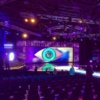
It seems like they've taken inspiration from my mock up (eye shape on floor, vertical light bars), but just not taken the entire idea and applied it in full. It is better than last year, but is it good enough? I guess we'll see at 8:40 pm
mistercat122
Longtime Lurker
I dunno really, like it's not horrible but it's not great either, everything looks a lot smaller to the old sets :/
looks great, cant wait to see it in action!
and yes, those projectors cost a shitload, (not so much the actual projector, but rather the lightbulbs inside them (im talking thousands of dollars))
can anyone make out what the glowy area is off to the right of the stage?
and yes, those projectors cost a shitload, (not so much the actual projector, but rather the lightbulbs inside them (im talking thousands of dollars))
can anyone make out what the glowy area is off to the right of the stage?
I thought the same thing. Especially after I heard they've got a crane camera too.It seems like they've taken inspiration from my mock up (eye shape on floor, vertical light bars), but just not taken the entire idea and applied it in full. It is better than last year, but is it good enough? I guess we'll see at 8:40 pm
Being Big Brother
View.Vote.Control
Especially after I heard they've got a crane camera too.
They've always had a crane camera (AKA "jib" or "jimmy jib"), which is how they get those sweeping shots of the crowd:

The on-air graphics during the 9 era have always seemed bland and dated to me. 10 always kept things looking young and fresh. I just wish 9 would have revamped things for this season. Every little bit counts to the success of a show.
Ten era: Eight seasons, four sets of opening titles
Nine era: Two seasons, two sets of opening titles
Being Big Brother
View.Vote.Control
@MJL The crane camera movements seemed to be quite inflexible if you look back to for example 2012 with the crane based on one side. Hopefully with it mounted to the roof truss it will allows for more creative angles.
Oh, has it definitely moved, then? That's good... Having it on the left always worked well enough until this where you could only see half of each pair of Housemates and there wasn't any coverage of the right-hand side.
I wanted to see Drew being handsome, not Tully's armpit.
@MJL, as @marquisite said, we haven't had a proper crane since Channel 10 days. It's been one of the most requested re-additions for the stage since Channel 9 took over - and sounds like they finally might've listened.
Bertrendo
Well-Known Member
I loved the extra lights and shiny triangles, it definitely filled up the stage better than last year and they are using the other other stairs behind Sonia's circle aswell this year. the walkway is really low, pretty much same height as the audience. and i can say now their is a new theme-song by the sound of it, when its goes to an ad break it was very... dramatic. The stage is definitely still channel 9 but adding 10 in their a bit. its definitely the best launch channel nine has done. i loved watching the housemates go in 2 by 2. whoops i think i have said to much. #GoJake
A good step towards bringing back the 'event tv' feel of the live shows. It's seems insignificant, but the big sweeping shots to a long way to creating a certain feel. Woo!@MJL, as @marquisite said, we haven't had a proper crane since Channel 10 days. It's been one of the most requested re-additions for the stage since Channel 9 took over - and sounds like they finally might've listened.
I don't mind the stage as it was / as it is. For me, it comes down to how they use the space in front of the screen. At the risk of sounding like a squeaky wheel. The couch will make such a (warm) difference to eviction interviews.
The massive rear projection screen is pretty impressive looking, especially if used correctly.
Gibo_33
Why am I here?
Could you please send a link to the vid!Think I just found a lil sneaky peek at the new theme music, listen to Sonia's interview on 2dayfm this morning, it plays at the start!
I hope that is. I like it.
MITCH!!!!
New Member
The Stage looks cleaner. Looks like its going to flow better than other years. The previous stages from the new big brother have looked segregated and have looked like 2 different sets in one. This set is starting to bring back the ch 10 days with multiple creative entrance points.


