Format and production thoughts

@Zcsund1234, any word on who came second and third last year and what the percentages might have been like? I mean, I know we have a pretty good idea but I'm still frustrated we don't know officially.

Me and my friends were quick to ask this question. I know on these forums someone stated it was 45% chad 35% Sophie and 20% Daniel ? Correct me if I am wrong. However the housemate we asked said they were completely told nothing at all regarding the % or placements and if any website tries to state what they are to not believe it at all. They said “I wouldn’t believe any articles writing them, no one was ever told”
 
Me and my friends were quick to ask this question. I know on these forums someone stated it was 45% chad 35% Sophie and 20% Daniel ? Correct me if I am wrong. However the housemate we asked said they were completely told nothing at all regarding the % or placements and if any website tries to state what they are to not believe it at all. They said “I wouldn’t believe any articles writing them, no one was ever told”
I really fail to understand the secrecy surrounding this. Why didn't they announce 2nd/3rd places?
 
Came across this version advertising for 2021... I like this concept heaps better and the way it is executed in comparison to how Seven did 2020...
It is evident that Endemol are the ones who brainstormed this style and logo of the campaign and is now shopping this "advertising" style and visuals of the show to other countries. That's now 3 versions that use the same logo?


Interestingly this two-pronged eye is the actual style that was released when Endemol did a rebrand of the international image of the format
You can see below where they started to go with it? I get 2005 symbol vibes.


It’s not uncommon for branding to be copied across international series. Endemic do seem to be pushing different versions of the new standard logo though.
 
It’s not uncommon for branding to be copied across international series. Endemic do seem to be pushing different versions of the new standard logo though.
Of course! However it is quite rare that the European countries are following the Australian branding. It has only happened a couple of times.
 
Another interesting thing I learnt. Sophie was a last minute addition to the cast. There was another girl who apparently pulled out last minute and Sophie was then contacted with small notice apparently. She also made it far into casting for the 2014 season as well.
 
Screen Shot 2020-10-13 at 1.45.40 pm.png
Interesting to see the Big Brother Wikia list the finale and the percentages as this?

I wonder where they got these percentages from and I believe this is what the votes would have looked like.
 
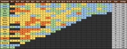
For anyone who is interested in this type of thing, I have just completed a rewatch of the series and decided to edgic it and create a diary room confessional count (it is probably very very wrong). I had a bit of fun with this, its interesting to visually see just how unbalanced the edit really was. Some episodes literally only featured 4 contestants receiving any form of personal content.

EDGIC.png
 

Attachments

  • CC.png
    CC.png
    97.1 KB · Views: 26
EDGIC.png
I am looking at this and cannot translate anything. What does it all mean?
 
I am looking at this and cannot translate anything. What does it all mean?

It’s used to predict winner edits in survivor. The abbreviations are

CP- Complex personally (typically main characters who get a lot of personal content and show strategic thinking through diary room confessionals and general airtime, these edits are given to main characters and narrators).

OTT- over the top (typically cartoonish, one dimensional, Goofy or unrealistic edits. Angela’s obsession with tea is a good example. These edits are just typically there to make the contestant look overtly cartoonish and one dimensional.

MOR- middle of the road (in a nutshell this edit essentially means side character. They don’t get a lot of personal content and they mainly just are there secondary to the CP character, they get scene and content but they lack overall development.

UTR- means under the radar, this type of edit is just when people are underused and don’t get any content or confessionals.

There’s also tones, P = positive, N = negative and M = mixed. This just means if the edit the person received was positive negative or a mix of both.

The number also is just a rank of 1-5 depending on how visible they were during the episode.
Well that's quite pertinent information. Although I did recognise UTR at least.
 
Of course! However it is quite rare that the European countries are following the Australian branding. It has only happened a couple of times.

An old one from 2007, but who remembers Poland? (Both opening graphic style with 3D cube eye and our old theme tune.)

EDIT: Also Germany's eye has Ch9 vibes:
 
Last edited:
Id love to see Big Brother in a sepia black and white.
And thermal heat sensors. To detect the blackness of their vapid hearts.
 
Would certainly be more interesting than the previous season.
Its gotta be more suspenseful.
Viewers are now so desensitised to reality tv twists and turns.
If I was in charge, Id advocate a Deer Hunter russian roulette scenario.
Give it some pathos.
 
Back
Top