Big Brother 2025 starts November 9 (Sunday) on 10

  • Thread starter Thread starter BB12
  • Start date Start date
  • Featured
It'll be a shame if that's the "permanent" aesthetic for the 2025 season. It's giving Seven's (and the current international branding) colour scheme.

The eyes in the pre-season promos are so much more creative, especially the one that incorporated a camera lens with the pupil.
 
Yeah definitely not a fan of this camp 7 inspired look.
I don’t know why there is the mandate to use the international branding ? It’s seems rather odd to me. If it has to be used I’d much rather what they were using up until this point - the human eye as the hero of the design.

This colouring also makes me worry that we aren’t going to have identifiable colours for evictions etc (red)
 
Idk how to feel about this now... I mean im glad they still have a physical/human eye... just seems very Ch9/Ch7 era branded 😬1000054413.jpg
 
They did that with the 9 revamp too, had an 05-07 looking eye which was fully animated (Can't find an image for reference) then went and fully changed it.
 
The eyes in the pre-season promos are so much more creative, especially the one that incorporated a camera lens with the pupil.

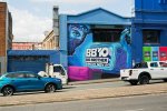
Because we are so close to launch, I didn’t think they’d introduce a new look.

I don’t mind the subtle 9/7 eye in pre promotion, but this new one is just too much.
 
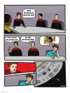
"Should we go with the old eye or a new one?"

RANDOMJPG.jpg
Haha. I literally had this exact same post as a thought about a potential comment to type out as I was scrolling through the posts.
 
Sign of things to come maybe, but surely they aren't that silly to change the branding 2 weeks out? It looked so good the way it was!
 
I can't see the font being the same with this new logo, all I'm seeing is some thin, lifeless, weak ass font now. I'm so mad 😬
 
Back
Top