The problem is the BB and 10 are both bold fonts that are kind of similar side by side. If they hadn't dropped the circle for the logo I feel it would have been more obvious it's BB on 10. Surely they had this discussion? It's triggering all the ND fans.Issue is 10’s current logo is too basic to be used in this way. Even separated I think it’s likely for it to be read as BB10 and not BB on 10 like they intended. That said I don’t think a blue circle would work in this context either so it’s really a lose/lose. At the end of the day I’m not bothered if the basic casuals find it “confusing”. Like I said the other day “Let them eat cake”.
-
Welcome to the discussion forums. To get posting, register an account.
You are using an out of date browser. It may not display this or other websites correctly.
You should upgrade or use an alternative browser.
You should upgrade or use an alternative browser.
Big Brother 2025 starts November 9 (Sunday) on 10
- Thread starter BB12
- Start date
- Featured
- Status
- Not open for further replies.
dasnico
Well-Known Member
How long ago did 10 drop the circle "ten" logo in favour of the number?The problem is the BB and 10 are both bold fonts that are kind of similar side by side. If they hadn't dropped the circle for the logo I feel it would have been more obvious it's BB on 10. Surely they had this discussion? It's triggering all the ND fans.
cowmoomoo
Member
dasnico
Well-Known Member
Oh wow.
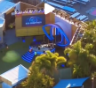
I can't say I really care for the stage area, even though it's cool. It's like a better version of it's ITV counterpart. The 5 people that manage to fit standing in there should have a good time.
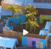
It's interesting the "zoo window" in the garden doesn't appear to have much of anything by it on the exterior.
YES! Look, I like it... I think - it's new and fresh for a BBAU series. My only concern is basically everything is adding up to this series being the closest incarnation to BBUK we've ever had. That stage set-up is nearly identical. I just really hope the replications stop with the design of the stage and house, and don't filter into the production style, tasks and format as well.
The 5 people that manage to fit standing in there should have a good time.
andrewpatrick_
Well-Known Member
Now I know why tickets to the live shows sold out so quick. Not many people are fitting in there!
dasnico
Well-Known Member
The garden actually looks pretty cool, albeit tiny to what the size of the yard was in the old compound. The palm trees are a nice touch and the colours seem to work well.
The massive BB eye on the south facing wall though. No. We know we're watching Big Brother.
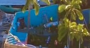
Also, this set in general just screams temporary. There is nothing permanent about it.
The massive BB eye on the south facing wall though. No. We know we're watching Big Brother.
Also, this set in general just screams temporary. There is nothing permanent about it.
To be fair, it does look relatively complete. Probably filmed a day or two ago. It looks like they’re doing tech checks and final touches in the lead-up to Thursday’s event.I wonder when this video was taken. Paramount upfronts are tomorrow. I would think everything should be completed today.
Also. Confirmation that the set truly is fully outdoors with no cover. That worries me during storm season.
Last edited:
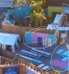
I’ve just had a thought that has shifted my theory about this. Unless I’m mistaken, it looks like there might be more than one of these small “windows” in the walls of the backyard. Could it be that this type of set-up makes it difficult to get fixed cameras in the right spots in the yard, so they’ve set up some hot spots for camera operators to stand behind and film from (like a makeshift camera run, per se)?It's interesting the "zoo window" in the garden doesn't appear to have much of anything by it on the exterior.
dasnico
Well-Known Member
I'm pretty sure I saw some small mirrors on the construction videos and photos shot in the interior. Either way, one way mirrors require it to be completely dark on the back side, so maybe a makeshift black out area can be placed there.I’ve just had a thought that has shifted my theory about this. Unless I’m mistaken, it looks like there might be more than one of these small “windows” in the walls of the backyard. Could it be that this type of set-up makes it difficult to get fixed cameras in the right spots in the yard, so they’ve set up some hot spots for camera operators to stand behind and film from (like a makeshift camera run, per se)?
dasnico
Well-Known Member
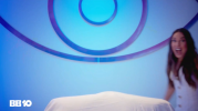
Or the DR could very well have another massive eye in it.Perhaps we’ve spotted where they shot the backdrop for the “Diary Room” promo…
View attachment 67982View attachment 67983
I'm sure all 20 in the crowd will be fine with their brollies.Confirmation that the set truly is fully outdoors with no cover. That worries me during storm season.
Forget the crowd. My thoughts are with Mel.I'm sure all 20 in the crowd will be fine with their brollies.
BB12
Well-Known Member
Yeah if that's the stage area, it's so tiny! No wonder it sold out so quickly.That stage area is pathetic.
- Status
- Not open for further replies.

