Initially I suggested that Big Brother did not need a logo. In my pitch proposal I presented ideas for each requirement of the programme, I proposed for example that the title sequence should be silent with a tensecond display of the archetypal broadcast countdown clock.
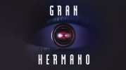
I was asked to make an identity but I really felt it didn’t need a logo. The horizontal black and white lines were really enough so that every time you saw the TV go strange you knew it was Big Brother – this ‘Orwellian’ game. I felt people watching TV should be affected by their own gaze. That effect would be enough to stand in place of a logo. But then I went to more meetings and I met Peter Bazalgette who is the boss at Endemol. He had a big vision for the programme and he felt that to achieve his vision it needed some kind of obvious mark or shape. He suggested eyes. To compromise I integrating a single eye concealed within the horizontal black and white lines. It resulted in an identity that stares back at the viewer, creating an optical sensation affecting the viewer’s gaze. This manipulation echoes the main ethos of the show and reflects its Orwellian sense of concealment, typified by the surveillance cameras distributed around the Big Brother house.