Theme song and opening sequence

Kingstevoh

Nominated Edward 7 Points for being Fake
I can't seem to get past how badly they botched the opening title sequence and theme song it's been stuck in my head for all the wrong reasons. What did you think of it?

Honestly, I reckon it's even worse than what Channel Nine came up with, which says a lot.
 
Honestly, I reckon it's even worse than what Channel Nine came up with, which says a lot.
Bingo, 10's remixed BB theme might be better than the unappealing mixes of 9's era but we hardly get to hear it. I've heard more of it in the next episode promos than the actual episode!

But nothing can top Channel 7's abomination without any theme tune at all.
 
Bingo, 10's remixed BB theme might be better than the unappealing mixes of 9's era but we hardly get to hear it. I've heard more of it in the next episode promos than the actual episode!

But nothing can top Channel 7's abomination without any theme tune at all.
100% they need to save their coins on buying commercial music for every ep and just stick to the theme song and use the extra funds to go back into the house. Or build a indoor stage.

Channel 7 was a abomination! I agree.
 
Yeah, they definitely feature it more in the promos than they do the actual episodes. Bizarrely, it's even a bit of a non-event in the ad break intro/outros.

Here I was pre-season, hoping they'd even bring back the Theme Diary Room Mix for evictions this year...😞
 
Ok thank you for setting up this thread. I love geeking out about the opening titles, I could literally watch the compilation video of the intros from the original run again and again, I think they’re all representative of their time, from the original being so SD to the 2008 series having that more edgier vibe they were going with. Agree with what’s been said here, what we currently have is MILES above what 9 gave us and what 7 didn’t give us, but it really wouldn’t take much to get it back to being perfect. The opening visuals are… fine. Nothing amazing, I wish they were longer and took us on a bit of a journey of the house or something. And I still hate the combo logo, I wish it was just the realistic eye and not the diamond eye. But the real issue is the music, it’s trying to smash different parts of different iterations of the original run in to one tiny 10-second sequence, and it all falls flat. It then becomes even worse when we get to the ad bumpers.
 
Here are a couple of isolated clips (talking removed) from some of the next episode promos:
https://vocaroo.com/18eCNNGHM6Lm - day 2 live special I think
https://vocaroo.com/1mKGKOu9bDqO - day 3 ds
https://vocaroo.com/1fBxSBLRYw3t - day 4 nominations

I have a hunch that the team making these promos could be more OG BB mega fans than the editing team for the episodes.

PS don't forget to vote in the poll I set up for whether you prefer the random music vs bb theme:
 
I’m watching the ep now on the app and definitely notice the extended title and Mel walk in Tuong was the theme. Felt so right! Thank you BB lurkers. ❤️
Positive reaction in tonight's Daily Show thread for this Live episode, not to mention the slightly extended and fuller sounding theme AND underscoring during Mel's walk onstage. Thank you, BB lurkers - if you're reading this!
 
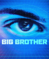
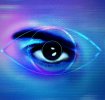
I know it’s slightly off topic as it’s not about the music, but the logo - my issue with it is this: tell me how it makes sense that there is an eye inside of another eye.

You’ve got this photorealistic eye that evokes 1984 and the original 10 era, which was mostly used in the lead up. 👁️

Then you’ve got this diamond eye 👁️‍🗨️ that is similar to ch5/ITV era BBUK and 9 / 7 era BBAU.

Pick one!

I would prefer the photorealistic eye but why are doing both it makes no sense and is fug 😭
Yeah I brought up the same grievance about it as well in another thread here. They should have just keep the real eye. That Uk like overlay on top is unnecessary. Looks better without it, and if they must add it in due keep it in line with franchise just have it minimal and not so thick and clashing
 

Attachments

  • 01191D95-6CFC-435D-B54E-6B76A55A7D26.png
    01191D95-6CFC-435D-B54E-6B76A55A7D26.png
    1 MB · Views: 11
@Hooden @Kingstevoh I mean just look at what could have been (with a heavy 2003 titles influence, I might add)

And even with a little bit of an oval eye creeping in could still look alright (I previously posted this on here, somewhere, but who knows where)
bbau10-2025-undoing-the-ch9-ch7-inspired-bad-eye-design.jpg
 
@Hooden @Kingstevoh I mean just look at what could have been (with a heavy 2003 titles influence, I might add)

And even with a little bit of an oval eye creeping in could still look alright (I previously posted this on here, somewhere, but who knows where)
View attachment 68896
J’adore @marquisite , need to get you in to the editing bay.

Personally I always loved the 05-07 theming with the cubes flying everywhere, and the eye made up of cubes like the one if your profile pic, but probably because that was the era I was most obsessed with. The 03-04 theming was incredible too.
 
@Hooden @Kingstevoh I mean just look at what could have been (with a heavy 2003 titles influence, I might add)

And even with a little bit of an oval eye creeping in could still look alright (I previously posted this on here, somewhere, but who knows where)
View attachment 68896
@marquisite elegant, fresh yet reminiscent! Love

Also with your mock titles using the season 3|4 sequence was superior. I love season 3 to season 7 titles. They should have really use that as a reference point.
 
I think the problem isn't just that the titles are short but they're also rubbish. I quite like the break stings but the eye logo on top of some stairs doesn't really scream Big Brother and feels very generic and somewhat dated too. I think even if it was a 10 second animation of flying through some rollercoasters and rides to reveal the eye logo it would at least feel on brand.
 
I think the problem isn't just that the titles are short but they're also rubbish. I quite like the break stings but the eye logo on top of some stairs doesn't really scream Big Brother and feels very generic and somewhat dated too.

I hear you. I've daydreamed how amazing the titles could have been especially with the OG 2025 human eye as well. What I wonder is if they even had an animation created using the old eye that we'll never ever get to see.
 
I think they were severely underestimating how much attention the theme song and titles would get by fans… 😂

I just looked back and, while the visuals and length remained the same, the opening audio had three different variations of the theme played over the course of the first six episodes. Launch, Nominations and Daily Show weren’t the same, with the Nominations ep using an almost completely different section of the theme (very 05-07 era) than the others did.

I think they were still tweaking before settling on what they ended up with by the last Daily Show of the week (basically two sections of the 01-04 theme overlapping). Still think it could find a happier medium if they extended it longer than 8 seconds.
 
I just feel like they would do really well if they leaned more in to the original 1984 inspiration of big brother, with the photo realistic eye / eyes, like they did through the entire original 10 run. Play in to the “big brother is always watching” vibe. This modern eye just does nothing for me, and is actually triggering for the 9 / 7 era.

IMG_2981.jpeg
 
Back
Top