oddjob
Well-Known Member
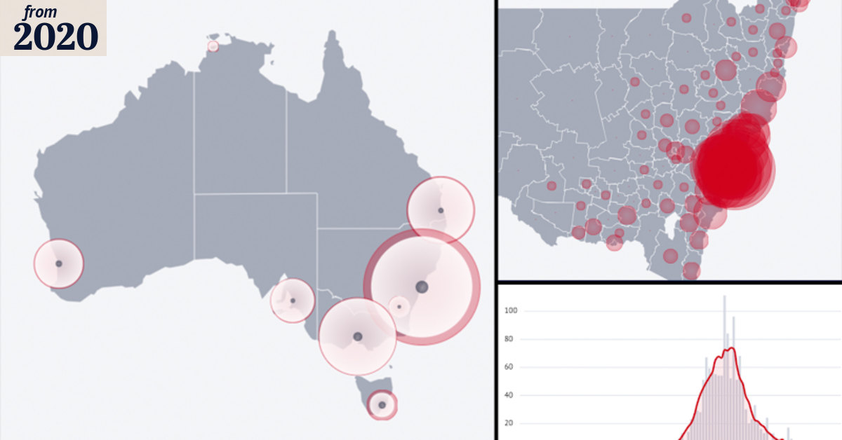
Trendline is starting to look like a peak.
 www.theage.com.au
One annoying thing (I learnt about on The Project) about the way they do these figures is that cases are assigned to the day the results are reported and due to the nature of "procedures" the reporting can get bunched up and that adds to the apparent volatility of the daily numbers. I'm guessing every test would be timestamped so they should be able to plot the daily cases against the actual test date.
COVID-19 data centre: Coronavirus by the numbers
The latest data on the coronavirus pandemic in your local area, across Australia and around the world.
One annoying thing (I learnt about on The Project) about the way they do these figures is that cases are assigned to the day the results are reported and due to the nature of "procedures" the reporting can get bunched up and that adds to the apparent volatility of the daily numbers. I'm guessing every test would be timestamped so they should be able to plot the daily cases against the actual test date.
