Theme song and opening sequence

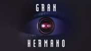
I just feel like they would do really well if they leaned more in to the original 1984 inspiration of big brother, with the photo realistic eye / eyes, like they did through the entire original 10 run. Play in to the “big brother is always watching” vibe. This modern eye just does nothing for me, and is actually triggering for the 9 / 7 era.

View attachment 69468
Well they did revert to a new version of the original eye until about a week before this launched. Must be a Banijay requirement. I suppose at least they kept it kinda?

I agree. The OG eye is better.
 
Well they did revert to a new version of the original eye until about a week before this launched. Must be a Banijay requirement. I suppose at least they kept it kinda?

I agree. The OG eye is better.
True. I feel like they added the newer eye last minute to try to appeal to those that enjoyed the 9 era.

I know there are plenty that are only aware of the nine era, especially the younger generations. I’ve said to people “I’m a big brother tragic” and they’re like “oh I love Drew and Tully!”… like that ain’t it.
You’re probably not wrong, but in my eyes that’s a super trivial change to make. I think people know the title “Big Brother” - if they thought adding that CG line art was what it took to draw in more viewers… I’m lost for words. Using original branding would’ve never turned away younger viewers, but more than likely would’ve pulled in older OG viewers.
 
You’re probably not wrong, but in my eyes that’s a super trivial change to make. I think people know the title “Big Brother” - if they thought adding that CG line art was what it took to draw in more viewers… I’m lost for words. Using original branding would’ve never turned away younger viewers, but more than likely would’ve pulled in older OG viewers.
But by adding this newer eye they’re getting g the best of both worlds.

Despite the fact that it looks fug
 
Must be a Banijay requirement. I

Still very much doubt that. If there was a requirement, they'd surely push for one that is shaped like their official logo with the shifted eye pieces. Plus, when Spain brought back the civilian version last year after, they've used a modernized version of their original logo as well (instead of using any of the eye of aesthetics that they've used on the celebrity versions in the last couple of years)
GH_spain.jpg
 
Still very much doubt that. If there was a requirement, they'd surely push for one that is shaped like their official logo with the shifted eye pieces. Plus, when Spain brought back the civilian version last year after, they've used a modernized version of their original logo as well (instead of using any of the eye of aesthetics that they've used on the celebrity versions in the last couple of years)
View attachment 69479
I stand corrected. It was actually a conscious decision by the Australian producers at the last minute… bodes well for the show then.
 
Was so pissed they didn't roll the opener, HOW HARD IS IT? IT'S 10 SECONDS!

Take the 30 seconds from the eviction announcement pause, there ya go
Or, y'know, from that literal 3-minute Previously On / Coming Up montage...

With all that time, they could've shown the titles and a 60-second "best bits" of the evictee at the end.
 
I just feel like they would do really well if they leaned more in to the original 1984 inspiration of big brother, with the photo realistic eye / eyes, like they did through the entire original 10 run. Play in to the “big brother is always watching” vibe. This modern eye just does nothing for me, and is actually triggering for the 9 / 7 era.
I have a feeling I've already said this here, maybe it was on Bluesky 🤔

But anyway, Daniel Eatock, the BB2-BB11 UK eye designer, initially pushed for something more 'Orwellian':
Initially I suggested that Big Brother did not need a logo. In my pitch proposal I presented ideas for each requirement of the programme, I proposed for example that the title sequence should be silent with a tensecond display of the archetypal broadcast countdown clock.

I was asked to make an identity but I really felt it didn’t need a logo. The horizontal black and white lines were really enough so that every time you saw the TV go strange you knew it was Big Brother – this ‘Orwellian’ game. I felt people watching TV should be affected by their own gaze. That effect would be enough to stand in place of a logo. But then I went to more meetings and I met Peter Bazalgette who is the boss at Endemol. He had a big vision for the programme and he felt that to achieve his vision it needed some kind of obvious mark or shape. He suggested eyes. To compromise I integrating a single eye concealed within the horizontal black and white lines. It resulted in an identity that stares back at the viewer, creating an optical sensation affecting the viewer’s gaze. This manipulation echoes the main ethos of the show and reflects its Orwellian sense of concealment, typified by the surveillance cameras distributed around the Big Brother house.

There's a lot of interesting eye stuff on his blog, but EPILEPSY WARNING for a lot of it tbh. 😅 https://eatock.com/2001/big-brother-2

It's a weirdly untapped area for BBAU, considering how much they did borrow from us in the latter OG era. I don't know that "evil" Big Brother would suit BBAU, but they could definitely do something more "surveillance-y".

Or just... not a naff CGI stage with a hole in it.
 
Or, y'know, from that literal 3-minute Previously On / Coming Up montage...

With all that time, they could've shown the titles and a 60-second "best bits" of the evictee at the end.
I've never understood the TV execs logic that viewers won't sit through a title sequence but will sit through a three minute recap.
 
Back
Top