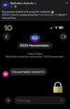
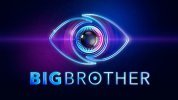
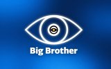
Yeah definitely not a fan of this camp 7 inspired look.
I don’t know why there is the mandate to use the international branding ? It’s seems rather odd to me.
I don't think there is a mandate.. for one, there are a lot of international versions that don't use any parts of the international branding, neither logos nor designs.
I think it's just that a lot of the smaller countries copied one design pattern, which made it seem like there is an actual international branding. Initially, some countries used the Polish design of the current international eye, probably because EndemolShine treated the Polish revival as some sort of new gold standard with it being filmed in an actual already existing house (that was previously also rented to other productions) instead of a purpose-built house or in a studio set. And then other versions would adopt the design and sometimes even the studio.
When the Dutch version came back (as a co-production with Belgium), they adopted a lot of the Seven branding.. basically just put the international eye on it and used a different font. Internationally, Endemol had a lot more love for the 7 version than Aussies did. A lot of designs and houses were inspired by the 7 house (even ITV took bits from the 7 houses). And Endemol were actually able to sell the rights for the 7 version to quite a few European broadcasters. It's just that international audiences had the same taste as Australian audiences and didn't watch.)Either way.. I think the Durch revival became a bit of the go-to version to copy for new or returning franchises.
But even then, the franchises could have taken the freedom to use a different design or adapt the logo a bit. Greece used their own design. Portugal eventually changed to the Australian colour schemes and would have red versions and pink versions, like 7 did. The initial Czech-Slovakian version at least changed the Dutch branding a bit, used a different font. I'm posting this one because with its 3-D effect, it looks a bit closer to the 10 version than the current Dutch branding.

When that version launched, they changed it even further and implemented the social media vibe from UK revival's first season (albeit a bit differently).. and thus moving even further away from he Aussie/Dutch template:

I think ITV's branding (and approach to the revival) in general was in the run of becoming the template for international versions. Bulgaria also based their version on ITV's revival.. but then they always followed the UK. Some say they only got cancelled because the UK version got cancelled and they weren't able to nick off their ideas.
When Germany announced casting for the revived civilian version, Endemol used a logo that was based on the UK eye as well (before the channel then using a branding that was based on their celebrity series):

Those outlines on the temporary logo from Germany remind me of what 10 has added to their initial logo.. so maybe they tried to pay homage to the UK eye, which is something that 9 has done as well.
I hope that they fix it though. It looks ugly.. and chances are that some international versions will adopt it. The international BB community has always had love for Australia's designs. Definitely expecting to see the branding in at least Portugal next year.
 . *I didn't read the full post and got over excited
  *
*